Dashboard
Learn what each area of the Dashboard shows and how merchants should use it.
Home answers three questions, in order: what did DynoWeb earn me, how healthy is my store, and what should I do next. It opens on This month so the numbers here line up with the session count on your plan.
Greeting Bar
The top of Home tells you the app is working and gives you the controls for everything below it.
Alongside the greeting you'll see a Tracker live badge — if it reads Tracker paused, DynoWeb isn't collecting anything and nothing below will update. Next to it sits the date-range picker (Today, Yesterday, This month, Last 7 / 30 / 90 days), a DynoAgent button that opens your AI CRO expert, and the notification bell.

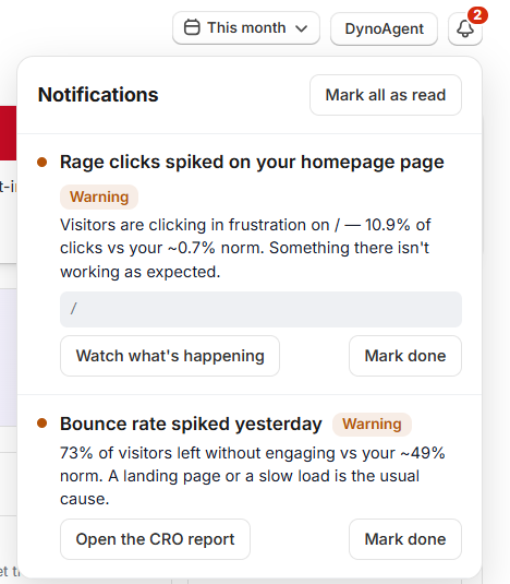
Notifications
The bell collects the changes worth your attention — a spike in errors, a drop worth investigating, a nudge worth reviewing — so you don't have to go hunting for them.
Each alert carries a severity (Critical, Warning, or Update), a plain-English detail, and a link straight to the surface that can fix it. Mark them done individually or clear them all at once. When there's nothing to report, it says so rather than inventing noise.
Banner
Directly under the greeting, Home shows one banner — never a stack. It's whichever thing matters most right now, in this order: storefront errors that could be blocking checkout, then your session limit (at the cap, then approaching it), then new high-impact suggestions waiting for review.
Banners aren't dismissible, because each one clears itself the moment the underlying problem does.
Money Earned
This is the headline: what DynoWeb made you this month, in your currency, above everything else on the page.
The caption splits the total into SmartNudge revenue and verified fixes, and View breakdown opens the full Impact scoreboard. Every figure here is an estimate measured against your own trend — never a guarantee. If the total is still zero, the card says so plainly and tells you to deploy a nudge or apply a fix to start attributing value.

Store Pulse
Four tiles give the fastest read on the store, each with a sparkline of its real daily trend and an up/down badge against the previous period.
Attributed sales, Sessions, Conversion rate, and revenue at risk (the value sitting in abandoned carts). Each tile is clickable and drops you into the matching Explore surface — sales and conversion rate into Conversions, sessions into Replays, and revenue at risk into Cart Overview. Before there's data, each tile says what it's waiting for instead of showing a zero.

Store Health
A single score out of 100 built from the signals DynoWeb already has on your store, graded Healthy, Good, Needs review, or At risk.
It's made of four factors, each one clickable so you can go straight to the problem: Performance (how fast the store feels), Errors (JavaScript errors firing on your storefront), SEO (issues waiting to be fixed), and Experience (how much frustration your sessions show). Factors only appear once there's signal behind them — a store with no replays yet won't show Experience.
This is a quick live read, deliberately simpler than the full audit. For the graded, benchmarked version, open the CRO Report from the card.

What DynoWeb Is Doing For You
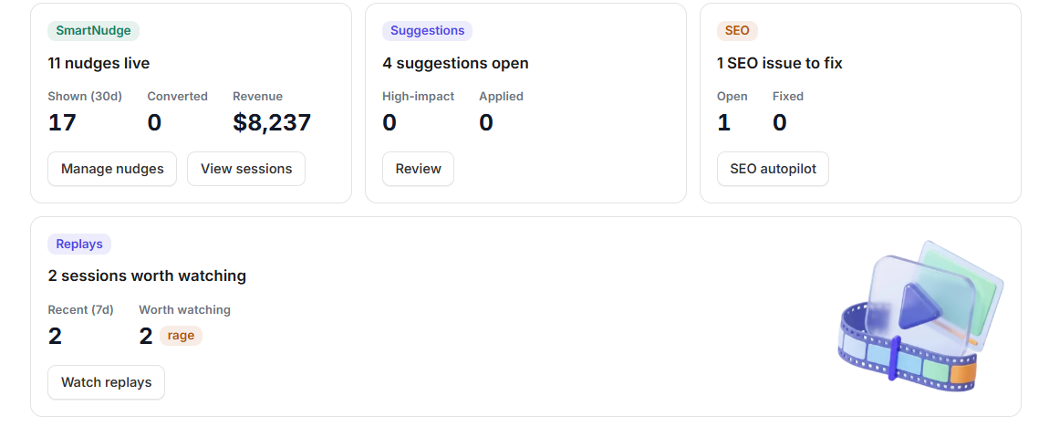
Below the health score, one card per capability — each showing what it's done lately and the single next action worth taking.
SmartNudge shows live nudges with what they've been shown, converted, and earned; with no nudges running, it shows how many visitors came back without buying and offers to win them back. Suggestions shows what's open and how many are high-impact. SEO, Storefront health, and Replays appear once there's something to report — SEO issues to fix, errors caught this week, or sessions worth watching.
Cards you don't need stay hidden. That's intentional: the grid only surfaces work that actually exists.
Explore Your Store
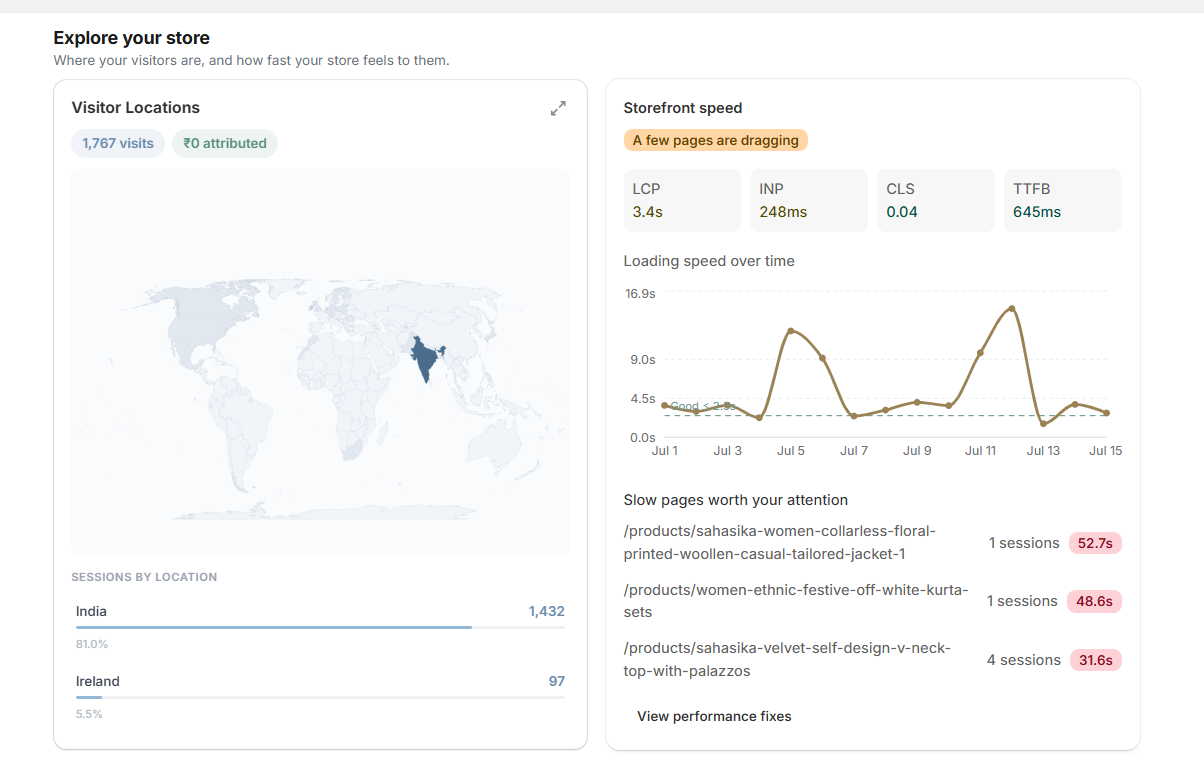
Two cards close out the page: where your visitors are, and how fast the store feels to them.
Visitor Locations maps sessions by country with attributed revenue alongside, and expands to a fullscreen view with state, region, and city-level drill-down where available.
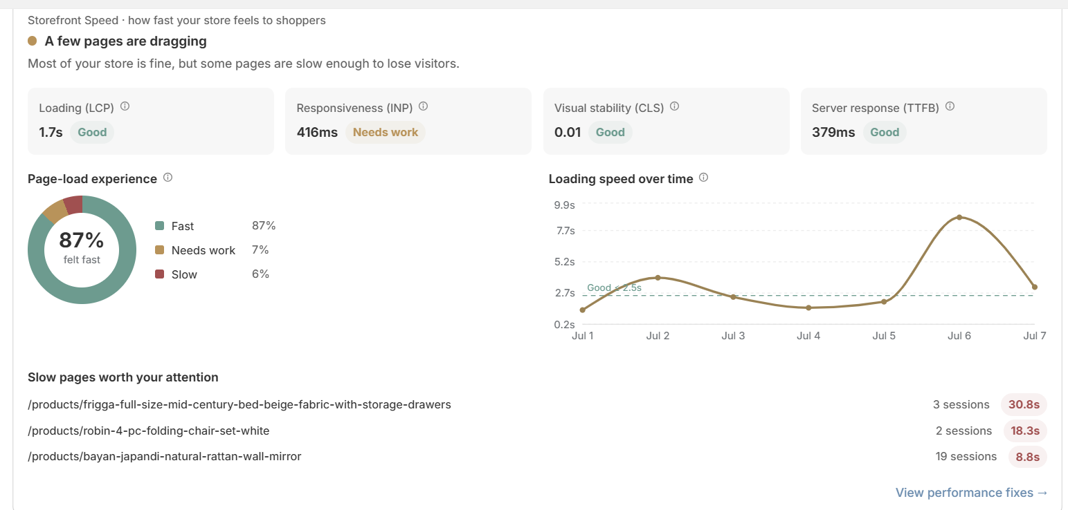
Storefront speed leads with a verdict, not a number — Your store is fast, A few pages are dragging, or Speed is costing you sales — so you know whether to care before reading anything. Below it are your four Core Web Vitals measured from real visitors, the same way Google grades you: Loading (LCP), Responsiveness (INP), Visual stability (CLS), and Server response (TTFB). Loading speed over time charts your daily trend, and Slow pages worth your attention ranks the pages that are dragging by the real revenue flowing through them — so you fix the slow pages that cost you money first. From there, View performance fixes takes you to the matching suggestions. On a new or low-traffic store, the card says there isn't enough data yet rather than inventing numbers.
Plan & Usage
The strip at the bottom shows sessions used against your monthly cap, with a progress bar.
Only real shopper sessions count toward the limit — bots and your own admin traffic don't. This is the same number the pricing page uses, so the two never disagree.

Going Deeper Into Pages
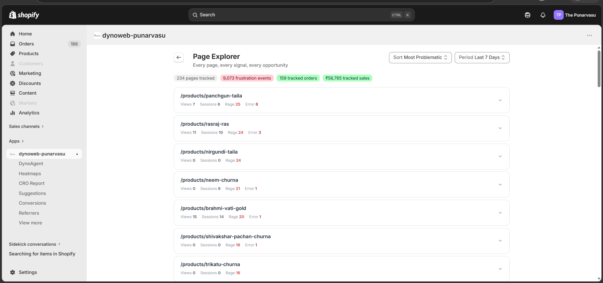
Home deliberately doesn't carry page-by-page tables any more. For the full per-page picture — traffic, engagement, scroll depth, revenue, orders, conversion rate, replay activity, health score, and related suggestions — open Page Explorer under Explore.
Sort it by Most Problematic to see the pages needing attention first, or Most Traffic to see where engagement is going.